House A


House A
Photos by Dion Robeson
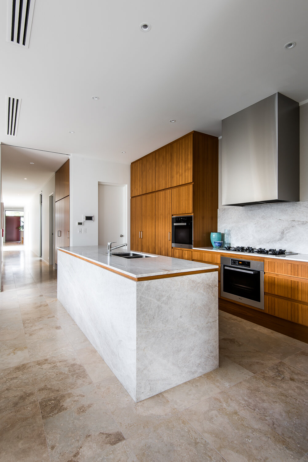
The primary brief requirement for House A was for all of the living spaces to be accommodated on a single level. This brief was an advantage on the long narrow lot – enabling setbacks to be minimised and the width of the house maximised to create generous living spaces on the single level. Maximising the width of the house in turn enabled creation of courtyards to divide the living spaces of the house into three distinct zones: (1) master bedroom, (2) guest/study, and (3) living / dining. This provides privacy for each zone, and, importantly northern light, a connection to the garden and cross ventilation for all internal spaces.
Seen in plan the house is essentially “E” shaped – with the three zones connected by a spine which runs along the length of the western boundary. The spine of the house contains the services (laundry, drying court, storage and kitchen) and a long corridor acts as a gallery. The journey through the gallery corridor of House A is punctuated by openings to the courtyards, providing a sense of space and depth despite the narrow block. Each zone of the house is articulated by ceiling height, proportion and light, creating spatial variation throughout the house. High ceilings and high level windows provide lots of natural light throughout.
House A sympathises with its neighbourhood in its presentation to the street and the detailing of the interiors. Elements of the facade of the house show the influence of local art deco architecture, including the strong horizontal bands of the parapet and windows, the white painted render, the concrete slab edge and the steel balustrade. Materials and detailing of interior spaces feel familiar and engage with the past. The neutral palette of materials (stone, quartz, teak and polished plaster) create spaces that are modern but feel warm and welcoming and provide an ideal backdrop for artworks, allowing the owner to add their own colour and personality.

